Trading Journal
In this case study, I’ll walk you through how I designed a Trading Journal App that helps traders understand their performance and improve through data-driven journaling.
Product
Web App
Responsibilities
User research, Design Thinking, Wireframing, UI Design, Prototyping, User testing
Timeline
Mar - Nov 2025
Team
Vipin
Links
Problem space
Back in 2021, during the COVID period, the Indian trading community exploded. Many new traders entered the market — including me. I’ve always loved financial markets, so I jumped in with full excitement. Like most beginners, I heard one common piece of advice from experienced traders: “If you want to improve, start journaling your trades”
So, I did. For two years, I manually wrote every trade and strategy in a physical diary. But despite the effort, there was little improvement. One day, while reading a thread on Reddit, a comment completely changed my perspective.
“Journaling isn’t just about writing your thoughts — it’s about tracking your performance metrics. Metrics like Win%, Average Win/Loss, Profit Factor, and even Brokerage/Expenses decide whether you’re profitable or not”
But maintaining all this on Google Sheets was exhausting — too manual, too messy, and far from intuitive. That’s when I realized how useful a dedicated journaling app could be.
Within four months, me (as the designer) and my friend (as the developer) built a simple first version of manual journaling MVP to help other traders improve their trading journey (journalmakebucks.in — it might take a couple of minutes to load since it’s hosted on a free Render Cloud tier). We invited 100 users to try it out, and the initial response was great around 30–40% DAU (Daily Active Users).
But soon after, the engagement started dropping… Here is why :(
User research
After the engagement started dropping, I began questioning — are we really solving the right problem? To get clarity, I decided to conduct user research with two main objectives:
Understand if traders actually face journaling challenges?
-- How do they currently track trades?
-- Do they even want to solve this problem?
Identify why users stopped using the MVP?
-- Was it due to UX, missing features or simply because journaling wasn’t a priority?
Research approach
To understand user behavior and pain points, I conducted telephonic interviews and a user survey. Participants: 15 active traders (mix of part time and full time). Research type: Qualitative (interviews) & Quantitative (survey)
Key insights
-- Traders do face the journaling problem but they just solve it inefficiently, because the tools available are either too manual or not built for traders.
-- Users dropped off mainly due to high manual effort and lack of habit support.
Full research
Problem statement
In today’s fast-paced trading environment, both full-time and part-time traders understand the importance of journaling — yet very few do it consistently. The existing tools feel tedious, overly manual, and not designed for traders’ real workflows.
For beginners, journaling often feels like an extra step on top of already complex trading activities. For experienced traders, the lack of structure and insights makes it hard to extract real value from their records.
As a result, many traders remain stuck in repeating the same mistakes, unable to identify what’s working, what’s not, and where they can improve. Without an efficient journaling system, they miss out on the self-awareness that separates profitable traders from inconsistent ones.
Recommended
Here’s a quick video where I walk you through the key features of the app.
Goals & Objectives
Make journaling effortless
Reduce manual effort and simplify the process so users can record trades quickly without disrupting their trading routine.
Make journaling feel rewarding
Help traders stay consistent by making journaling visually engaging and turning their raw trade data into clear, meaningful insights.
Support multiple trading strategies
Allow traders to categorize and track the performance of different strategies individually, helping them identify what truly works.
Each community driven learning
Enable community-driven learning. Provide a structured way for users to share their journaled trades, discuss outcomes, and learn from others
Ideation & Low-fidelity wireframes
Before moving into detailed design, I explored multiple layout ideas through quick pencil sketches. I gathered inspiration from real trading journal apps and a few conceptual dashboards on Dribbble, then translated those ideas into rough wireframes.
These sketches helped me:
-- Visualize the core structure of the dashboard
-- Map how trade journaling and review flows should work
-- Explore different ways to present metrics, strategies, and logs
-- Iterate fast without worrying about visuals
Below are the initial low-fidelity explorations I created before moving into digital wireframes.

Final designs
Here’s a quick walkthrough of the core user flows of the app. Covering Onboarding, Journaling, Strategy creating & mapping, AI-powered insights and Community sharing.
Onboarding
After signing up, users go through a quick 5-step onboarding flow with few questions these help us understand the users better, so we can design and prioritize features based on real trader needs.
Some users may hesitate to connect their broker account on the first interaction, so I added a ‘Skip login’ option. This lets them explore the app freely with demo data and understand the experience before committing.
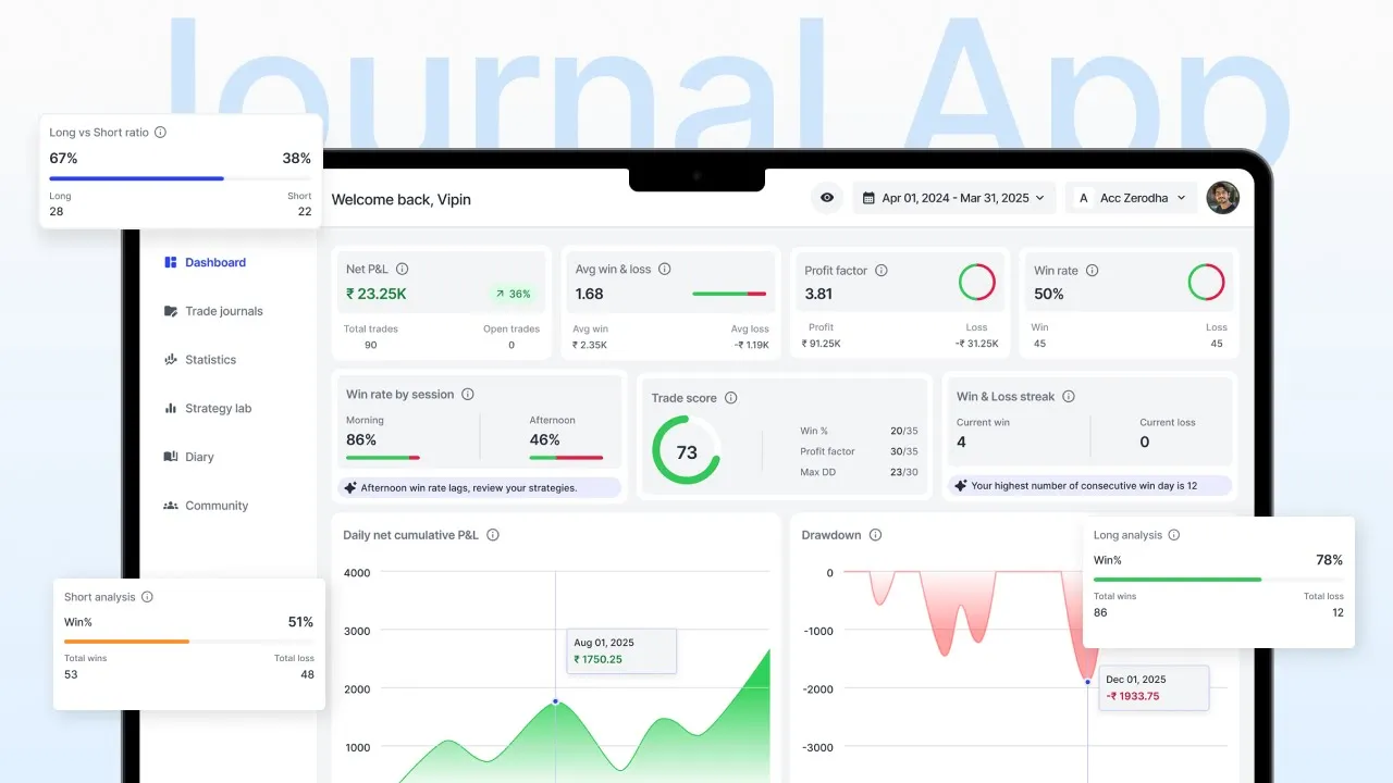
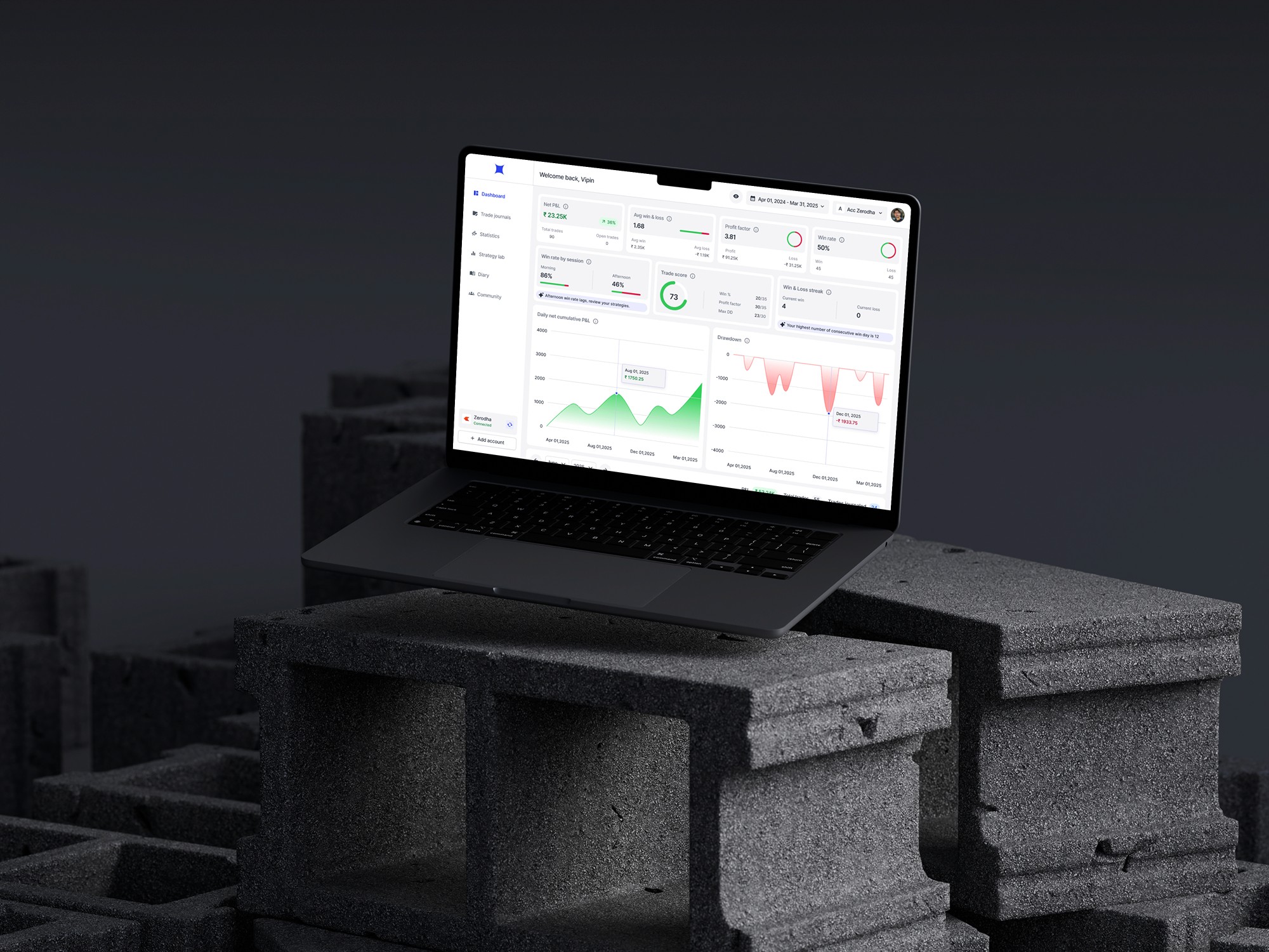
Once the broker is connected, users see a smooth loading state while trades sync. After syncing, the dashboard opens with all their past traded data broken down into key metrics like total P&L, win rate, equity curve, Trade score and more. These metrics help users generally see what’s happening inside their trading account overall.
A ‘Connected’ status in the sidebar confirms the integration, and all future trades are synced automatically for journaling.
Journaling trades
Journaling is the core flow of the product. In the old MVP, many users dropped off during this step because the form felt heavy and repetitive. When traders had multiple trades to journal, the process became time-consuming and leading to low completion rates.
Here’s how the journaling form looked in the live MVP version.

Filling this once was fine, but doing it for multiple times back-to-back made the experience feel boring and effort-heavy. For the new version, my goal was simple: Reduce manual input and make the journaling flow feel effortless.
Introduced a progress stepper inside the journaling pop-up. This pattern breaks the form into smaller steps, reducing cognitive load and helping users focus on one thing at a time instead of feeling overwhelmed by a long form. This not only makes the process smoother but also increases the likelihood of completing the journaling flow.
Statistics
Once users journal enough trades, all their data is processed and displayed inside the Statistics tab. This tab is split into two segments. Performance Metrics (Breakdown of trading quality & outcomes) and Time Metrics (Performance patterns across time windows) giving traders a clear breakdown of their trading edge/behavior.
Every metric shown here was selected based on user research to talking traders and competitor analysis. These data points inside statistics tab help traders understand their consistency, behavior, and overall edge.
AI Summary
During research and conversations with users of the old version, I noticed that many beginner traders struggled to make sense of raw metrics and often missed the insights hidden behind their journaling data.
Raw statistics felt overwhelming, and beginners had no clear way to understand what the data actually meant.
The new AI Summary converts complex trading metrics into short, easy-to-read insights that highlight patterns, strengths, mistakes, and improvement opportunities. It helps traders understand their performance instantly, identify patterns they might not notice on their own, and get clear direction on what to improve next.
This makes the app feel less like a dashboard of numbers and more like a personal trading coach. And whenever needed, users can save these insights into their Trade Diary for future reference.
Strategy creation & mapping
Most traders use multiple strategies — they might not have a single, fixed strategy. The Statistics tab has a small drawback when users are using multiple strategies on their trading broker, the problem is traders performance metrics are mixed together. It’s impossible to track which strategy performs well and which one is losing money inside the statistics tab.
To solve this, I created a dedicated Strategy Lab where traders can create strategies, define their rules, and map them to trades during journaling. This gives every strategy its own performance and time-based metrics, making the insights far more meaningful.
Strategy performance & comparison
In the old live version, the Strategy Lab existed under a different name (“Manage Tags”) and offered very limited visibility. It showed only a few basic metrics

With the redesigned Strategy Lab, traders can now view complete performance dashboards for each strategy, including individual metrics, strategy comparison, and even index benchmarking.
Individual metrics - Users understand how every strategy behaves on its own. It’s like a mini statistics tab but a detailed breakdown of one single strategy.
Strategy comparison - Users can compare two strategies side-by-side to identify which setup has a stronger, more reliable edge and delivers better performance. If one strategy has very few trades comparing to the other, a small nudge appears to remind them the comparison may not be fair.
Index benchmarking - Users can compare their strategy performance to benchmark indices like NIFTY — to check if the strategy truly outperforms or underperforms the market.
Each section also comes with an AI summary, helping beginners interpret their strategy performance in simple English. These three features inside Strategy Lab help users get a clear breakdown of how a strategy behaves, performs, and evolves over time.
Weekly/Monthly recap
From user research and the old MVP, I understood something important — traders know journaling is valuable, but that doesn’t guarantee consistency. To build a long-term habit, the product needs a ritual or a rewarding moment that encourages users to return.
I explored three possible habit-supporting features: Journaling Streak, Gamified Badges, and Weekly/Monthly Recap Cards. I chose the recap approach.
Recap cards transform raw data into a simple data story — like a mini “Spotify Wrapped” for trading. Example: “Trade of the Week: Your best trade was Reliance. You followed all the rules and earned +₹9200.”
With the redesigned Strategy Lab, traders can now view complete performance dashboards for each strategy, including individual metrics, strategy comparison, and even index benchmarking.
These recaps make the experience feel personal, as if the app is aware of the trader’s journey and celebrates meaningful highlights. It transforms journaling from a task into a rewarding reflection ritual, helping users build consistency.
Community sharing
Many traders already share their trade ideas through Discord, Telegram, WhatsApp, and other groups. Platforms like Frontpage and Stocktwits are good examples of community discussion spaces in the trading world.
I wanted to bring a similar social layer into the app, but with one important difference: every shared post is backed by verified P&L, real trade data, and the actual strategy logic behind the trade.
This feature creates a transparent learning environment where traders can study real trades backed by verified data, not just opinions. It helps traders compare decision-making styles, and turns journaling into a shared learning ritual rather than a solo activity.
Usability testing
I conducted a moderated usability test with traders who had used the old version of the app. This was done after I had a functional prototype ready. Since the journaling flow is the core part of the product and the main place where users dropped off in the old version. I focused heavily on validating journaling flow.
All the users were able to complete the journaling process smoothly without any direct guidance. However, a common question came up from two of them: “If trades are already synced from the broker, how do I journal older trades from previous days or previous months?”

Problem
In this design, the Trade Journals tab only showed today’s trades and upcoming trades. If users wanted to journal older trades, they had to go to Statistics → Trade Logs and do it from there.
I intentionally kept it this way to avoid cluttering the Trade Journals tab with all trades from the financial year. But this created confusion because users didn’t know where to go for older trades.

Solution
In the redesigned version. All trades, including older ones are available inside the Trade Journals tab. By default, users only see the current month’s trades to keep the UI clean. If they want to journal older data, they can simply use the custom date picker.
To avoid confusion, I added a small inline note: “You’re viewing the current month’s trades. Use the date picker to check past trades or journal older ones.” This keeps the interface clean while giving traders control and clarity.
Conclusion
That’s a wrap!!! Thanks for taking the time to read my case study. I hope you enjoyed walking through the journey as much as I enjoyed building it.
If you’re curious to explore more of my work, here are the full project links.
Also, if you’re a trader and want to try the app, here’s the old MVP version (free to use — might take a few minutes to load)